There’s a lot of terminology that gets thrown around when talking about art, I thought it would be helpful to start a series where we break down some art lingo bit by bit so you too can sound extra fancy when someone decides to break down the visual components of a Mondrian over some absinthe.
Let’s start with some colour theory!
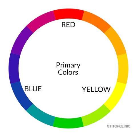
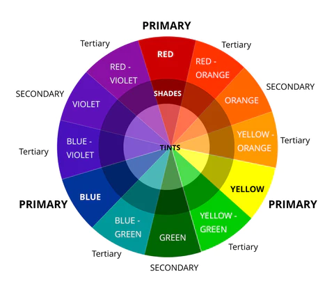
Primary colours
In traditional colour theory (used in paint and pigments) the primary colours are the 3 colours that cannot be mixed-red, yellow and blue. These colours (or hues) can be combined to make all other colours but you cannot make them.
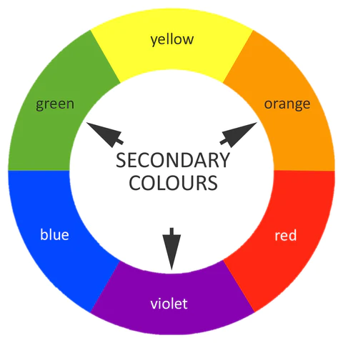
Secondary colours
Secondary colours are made by mixing different combinations of the three primary colours. The three secondary colours are green, orange and purple/violet. (On the traditional colour wheel a colour is created by mixing the two colours on either side of it (except for the primaries!).)
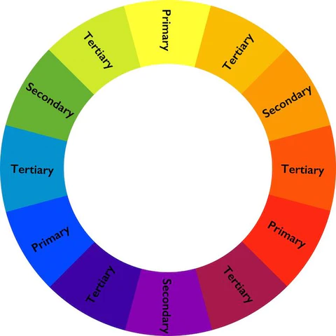
Tertiary Colours
Tertiary colours are the inbetweeners-you get them when you mix a primary colour (blue, yellow or red) with a secondary colour (yellow, purple or orange): Yellow-orange, red-orange, red-purple, blue-purple, blue-green & yellow-green (or things like lime or plum if we’re giving them more appealing names)
Tints, Tones and Shades
A tint is where white has been added (aka lightening up the colour, so pink is an example of a tint-white has been added to red)
A tone is where grey has been added (aka, taking some of the intensity of the colour out-the first example I can think of is a sagey green, a muted but still recognisable colour)
A shade is where black is added to a colour (aka making it darker-think something like navy blue)
Now we have the basics, how do we use these colours together to create interesting colour schemes?
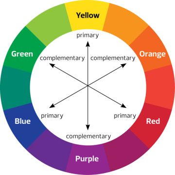
Complementary Colours
Complementary colours are any two colours which are directly opposite each other on the traditional colour wheel. They’re as far from each other on the spectrum as possible which means when you put them next to each other they make each other pop (you’re getting the visual equivalent of maximum contrast, the black and white of the colour world). For example red and green, yellow and purple and blue and orange are complementary colours.
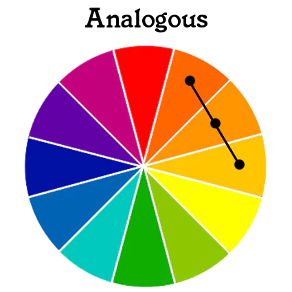
Analogous/Harmonious Colours
Analogous/harmonious colours sit next to one another on the colour wheel. It doesn’t matter in which direction. Pick a colour and use the colours on either side and it will work! Using a harmonious colour scheme creates a balanced and unified colour palette as the colours are all related to each other but also different enough to pop!
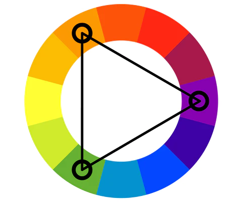
Triadic Colours
Triadic Colours are equidistant apart from one another on the colour wheel. Use a triadic colour scheme if you’re wanting something really dynamic with a lot of contrast that still feels balanced and thought out.
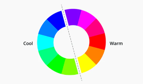
Warm and Cool Colours
Draw a line through the middle of the colour wheel and you’ll get your warm and cool colours. Your warms are anything in the reds, oranges and yellows and your cools are anything with blues, greens and purples.
Tonal/Monochromatic Scheme
A tonal scheme or monochromatic scheme means you use just one colour but in varying tones/tints/shades. Think of those strips from the hardware store when you’re picking a paint colour. If you only used colours from that one strip your colour scheme is going to be a bit bland as there’s not much visual difference, it’s basically the same colour just a bit lighter or darker.
